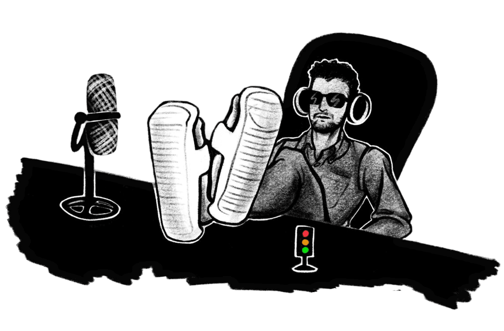
Redesigning the Clearsight Dashboard: modern, intuitive and accessible.
Redesigning the Clearsight Dashboard: modern, intuitive and accessible.
04 min read | Last updated: 18 June 2025
04 min read | Last updated: 18 June 2025


My Role
My Role
Lead UX designer
Lead UX designer
Timeline
Timeline
3 months
3 months
Status
Status
Shipped
What I delivered
What I delivered
Research | Strategy sessions | UI design
| Prototyping
Research | Strategy sessions | UI design
| Prototyping
"Make our Dashboard modern"
That was the one-line requirement I got when I was assigned to this project. For me, "modern" wasn’t just about aesthetics. It meant
Creating a dashboard that felt fresh without disrupting core functionality.
Offered simple scalable flows.
Accessible to everyone.

A screenshot of Clearsight Dashboard before re-design.
Updating widgets
Since over 90% of the dashboard is made up of widgets, modernizing them was central to the redesign effort. We’ve updated all the icons to match our updated icon library. We adjusted font sizes to establish a clearer visual hierarchy, making it easier for users to scan and focus on key information quickly.
We refined widget states default, hover, active, and loading to give clearer feedback and improve action discoverability. We reworked tooltips to be more contextual and concise, ensuring users get the right help exactly when they need it.

A summary of all updates on Widgets

Before and after screenshots of the widgets
Introducing Edit Mode and View Mode
The Clearsight Dashboard offered many permission options that determined who could make changes and who could not. However, the earlier design wasn’t intuitive, and the abundance of buttons made the interface busy and confusing. To improve this, we reorganized the options, grouped them logically, and introduced three clear modes: Edit Mode, View Mode, and Just View Mode.

View Mode, Edit Mode, and Just View Mode

Screenshot of design documentation for Edit Mode
Refreshing the Color Palette
One of the key steps in modernizing the Clearsight Dashboard was updating the color palette to make it more cohesive, accessible, and visually appealing. We introduced 21 new color tokens, each carefully selected to ensure sufficient contrast when placed side by side. These colors are consistently applied to charts based on the number of data points, ensuring clarity even in dense visualizations.

A summary of all updates on colours
We also created clear guidance on how and when to use each color, helping both designers and developers maintain visual consistency. The new system not only improves readability and contrast especially for users with visual impairments but, also brings a sense of harmony and polish to the overall UI.

Before and after screenshots of the updated tooltips
New empty states
We also introduced redesigned empty states that are more contextual and engaging. Instead of leaving blank spaces, these states now guide users on what actions they can take, reducing confusion and making the dashboard feel more complete.

New empty state illustrations
What's next ?
Even though this is a significant upgrade, there are still underlying challenges caused by the legacy system that are more complex to solve. We’re continuously researching, designing, and validating solutions to address them.
"Make our Dashboard modern"
That was the one-line requirement I got when I was assigned to this project. For me, "modern" wasn’t just about aesthetics. It meant
Creating a dashboard that felt fresh without disrupting core functionality.
Offered simple scalable flows.
Accessible to everyone.
A screenshot of Clearsight Dashboard before re-design.

A summary of all updates on Widgets

A summary of all updates on Widgets

A summary of all updates on colours

Before and after screenshots of the updated tooltips
View Mode, Edit Mode, and Just View Mode
Updating Widgets
Since over 90% of the dashboard is made up of widgets, modernizing them was central to the redesign effort. We’ve updated all the icons to match our updated icon library. We adjusted font sizes to establish a clearer visual hierarchy, making it easier for users to scan and focus on key information quickly.
We refined widget states default, hover, active, and loading to give clearer feedback and improve action discoverability. We reworked tooltips to be more contextual and concise, ensuring users get the right help exactly when they need it.
Refreshing the Colour Palette
One of the key steps in modernising the Clearsight Dashboard was updating the colour palette to make it more cohesive, accessible, and visually appealing. We introduced 21 new colour tokens, each carefully selected to ensure sufficient contrast when placed side by side. These colours are systematically assigned to charts based on the number of data points, ensuring clarity even in dense visualisations.
We also created clear guidance on how and when to use each colour, helping both designers and developers maintain visual consistency. The new system not only improves readability and contrast especially for users with visual impairments but also brings a sense of harmony and polish to the overall UI.

More case studies

Quick buy redesign for ticket vending machines led to customer satisfaction of 4.3/5
The improvements focused on user control, detailed information, and a seamless experience, significantly enhancing usability and user trust

Reimagining disruption communication: The journey from Nexus Alpha to the Rainbow Board
Enhancing transparency and user experience with a colour-coded solution on the Avanti West Coast homepage.
More case studies
Quick buy redesign for ticket vending machines led to customer satisfaction of 4.3/5
The improvements focused on user control, detailed information, and a seamless experience, significantly enhancing usability and user trust
Reimagining disruption communication: The journey from Nexus Alpha to the Rainbow Board
Enhancing transparency and user experience with a colour-coded solution on the Avanti West Coast homepage.
Introducing Edit Mode and View Mode
The Clearsight Dashboard offered many permission options that determined who could make changes and who could not. However, the earlier design wasn’t intuitive, and the abundance of buttons made the interface busy and confusing. To improve this, we reorganized the options, grouped them logically, and introduced three clear modes: Edit Mode, View Mode, and Just View Mode.
Made with music and loads of chai

Made with music and loads of chai
Made with music
and loads of chai
Redesigning the Clearsight Dashboard: Modern, Intuitive and Accessible.
04 min read | Last updated: 18 June 2025
My Role
Lead UX designer
Timeline
3 months
Status
Shipped
What I delivered
Strategy sessions | UI design | Prototyping
"Make our Dashboard modern"
That was the one-line requirement I got when I was assigned to this project. For me, "modern" wasn’t just about aesthetics. It meant
Creating a dashboard that felt fresh without disrupting core functionality.
Offered simple scalable flows.
Accessible to everyone.
Updating Widgets
Since over 90% of the dashboard is made up of widgets, modernizing them was central to the redesign effort. We’ve updated all the icons to match our updated icon library. We adjusted font sizes to establish a clearer visual hierarchy, making it easier for users to scan and focus on key information quickly.
We refined widget states default, hover, active, and loading to give clearer feedback and improve action discoverability. We reworked tooltips to be more contextual and concise, ensuring users get the right help exactly when they need it.
A screenshot of Clearsight Dashboard before re-design.
A screenshot of Clearsight Dashboard before re-design.